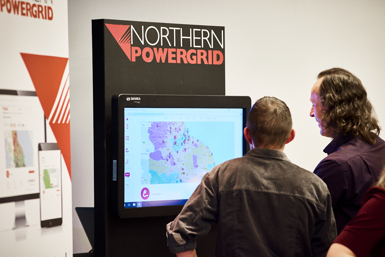
Heat map training
We delivered training on our network availability heat maps for users.
Our network availability heat maps form part of a suite of free online tools we make available for customers who want to conduct their own upfront assessments. In most cases, these are the same tools used by our own design engineers.
We were the first DNO to launch heat maps and make this level of detailed network information available to customers. The web view of our heat maps helps our customers to understand where there is capacity to connect to our distribution network using a simple red, amber, green traffic light indicator.
In December 2019, we began publishing detailed datasheets that sit alongside the web view heat maps. The downloadable datasheets provide a wealth of additional information that is not currently available via the web view. They also contain ‘how to’ guidance for customers on how to use our heat maps and a glossary of terms.
In the same month, we hosted a webinar aimed at new and existing heat map users. We wanted our stakeholders to have an improved understanding of the data available to them and for them to be able to make more informed decisions about network capacity and where to connect. The webinar was well received and, when asked to rate their satisfaction with the session, all those who responded unanimously agreed that it had improved their understanding of how to use our heat maps.
We have worked hard this year to raise awareness about our heat maps and the data we make available, delivering briefings at our Connections Customer Forum and DG Owner Operator forum and providing bespoke, one-to-one training sessions for those who requested it.
A recording of our heat map webinar is available on our YouTube channel at: youtube.com/NorthernPowergrid
View timeline

